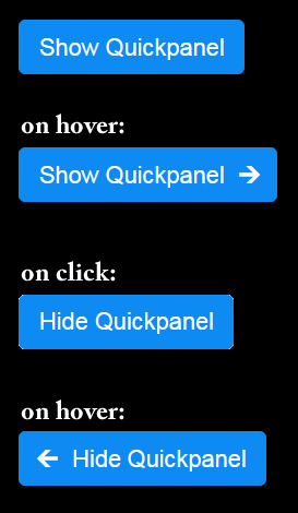
One of the components I am working on is a "read more" link (or button) that can display an arrow to the right, eased in and out on hover.
 I got it working very nicely. When you hover over the Show Quickpanel button, a really nice arrow (unicode object) is eased into position over a 1s transition timeline. The effect is really good. Now, I've seen these before and mine isn't much different.
I have never seen a "read less" link or button before. And, I built one with similar effect, but the arrow on the left side. You can see the effect of both the right and left at the image on the right.
It comes in handy for the Quickpanel component I built.
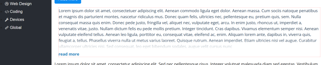
I also use this effect on a div that is height controlled. What I wanted to do was build a card with a div and have multiple div's side by side, all of equal height - regardless of content. I did that and added a "read more" link with the same effect as you see at the right. The text inside the content has the bottom appearing like it is disappearing from view with a gradient effect. When you click on the "read more" link, the div expands to display the entire contents, the "read more" link changes to "read less" ...
As a user interface element, it's excellent!
I've take a screen shot of the effect and shown it below. The div has a red dotted border around it, near the bottom of that div is where the text starts to disappear. The "read more" link expands to show an arrow to the right, click and the entire div expands to show all the text and the linke changes to "read less" with an arrow to the left on hover.