Rethinking this issue.
On initial view, it appears the answer is clear: using both makes sense. Flexbox has some features not available in CSS Grid (auto width columns, for example) while CSS Grid has features not available (or broken) in Flexbox (gap, for example, doesn't work in "wrap" mode of Flexbox, trying to get columns to be same height is a nightmare).
I have to rethink all of this. There's a few things that don't make much sense.
My Flexbox CSS file is now at 12Kb and includes 441 lines of code. That is quite condensed compared to the bloated "B" CSS Framework (35Kb) – but still, I can't get over that I can create a 12 column grid with as little as four lines of code in CSS Grid ... and get gap working in wrap mode at the same time.
Then there's the argument – or "excuse" – that CSS Grid and Flexbox aren't really the same thing. Flexbox, they say, is a one-dimension grid system while CSS Grid is two-dimensional. That's sort of true, and sort of false. Flexbox is definitely more of a column type of grid system while CSS Grid can define both rows and columns. However ... all the layouts for both Flexbox and CSS Grid use nesting to achieve two-dimensional designs.
If you follow the KISS strategies (Keep It Simple, Stupid) you will nest.
Here's another reason for the re-think. I'm trying to keep everything semantic. The BS introduced by "B" bloated CSS Framework of having a class for every tag is as dumb as you can get. WTF do you need to define a footer tag as <footer class="footer"> for? That POS "B" already did a mini-reset and did away with all the default CSS, using the excuse that you can still define <footer> doesn't make sense. I want to use <footer> only and have a real footer appear on the page. And I want that footer to be at the bottom of the page ... not with a complicated work around (it's not even available in the BS "B" CSS Framework).
Assuming you have a page that includes three vertical elements: <header>, <main> and <footer> all it takes is a handful of CSS lines and you have it all done. Here's what I mean:
body {
  column-gap: 0.75rem;
  display: grid;
  grid-template-areas: 'header' 'main' 'footer';
  grid-template-rows: auto 1fr auto;
  grid-template-columns: 100%;
  min-height: 100vh;
  height:100%;
  row-gap: 0.75rem;
  > header {
    grid-area: header;
  }
  > main {
    grid-area: main;
    padding: 15px 5px 10px 5px;
  }
  > footer {
    grid-area: footer;
  }
}
Might look a bit weird to you. I am using native selectors in a pure CSS file. In the case above, that means the CSS code applies only to the <header>, <main> and <footer> as direct "child"s of the body tag. It will NOT apply to <header>, <main> or <footer> under other tags (like a div card or <article>). And it's fully supported by all browsers.
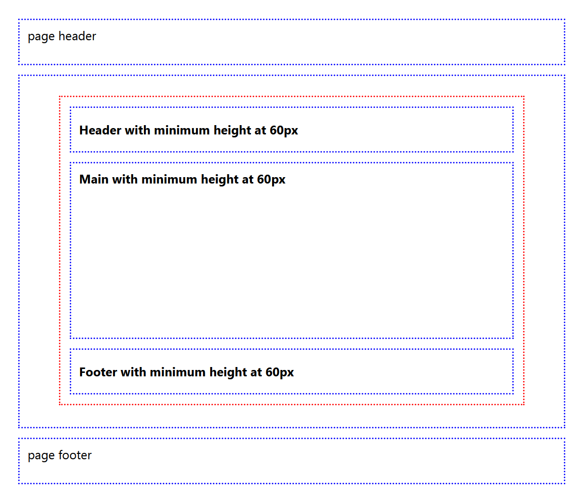
Have a glance at the image at the right. That's a result of the code above. Note there are two sets of <header>, <main> and <footer> tags. One on the outer portions of the page, and one inside the main tag.
The center portion is inside a <article> tag set. While they appear the same as the outer set, look closely. The <header> and <footer> tags inside the <article> tag set are centered vertically, while the <header> and <footer> tags under the <body> tag are vertically at the top (and also all content inside of those is bold). It's not trivial. This means you can define the tags differently ... and conditionally.
I am still working on some testing. Those tests use CSS Grid exclusively (no Flexbox). So far, CSS Grid is coming through. It's doing everything, including offsets (although I don't use offsets that much, it's still a requirement). I've found a really neat way to control CSS Grids on the fly too. More on that in future articles – but here's a teaser.
One of the main reasons to use a CSS "framework", either third-party (like Bootstrap, Tailwind), or do-it-yourself is to avoid having repetitive code in style attributes. They are hard to maintain, hard to update (and get them all) and a great waste of time. However, that doesn't mean we should stop using the style attribute. Just use it for exceptions, not to define overall styles. Style atributes, combined with CSS "framework" is valid. Just look at some of the big CSS Framework designs. Point made.