It really is getting easy. The key to going classless is to treat everything as a block.
First, there is the "wrapper" itself. Most of the time that is <section, or <article, or even a <div with a class name something like class="hero-wrapper" ... recognize that?
It's that "wrapper" that is key in thinking of this as a block that can be classless.
While researching over the past few days, I stumbled onto a site showing a pricing panel. I've seen these before, it's essentially three to five panels, each featuring a product or service and range from Basic to Platinum with price increases along the way, one being the recommended one. When you hover over each of the featured panel, it usually has a change in color, size ... something to indicate your hover status. And, of course, there is the CTA (Call-To-Action) button to launch you into buying mode.
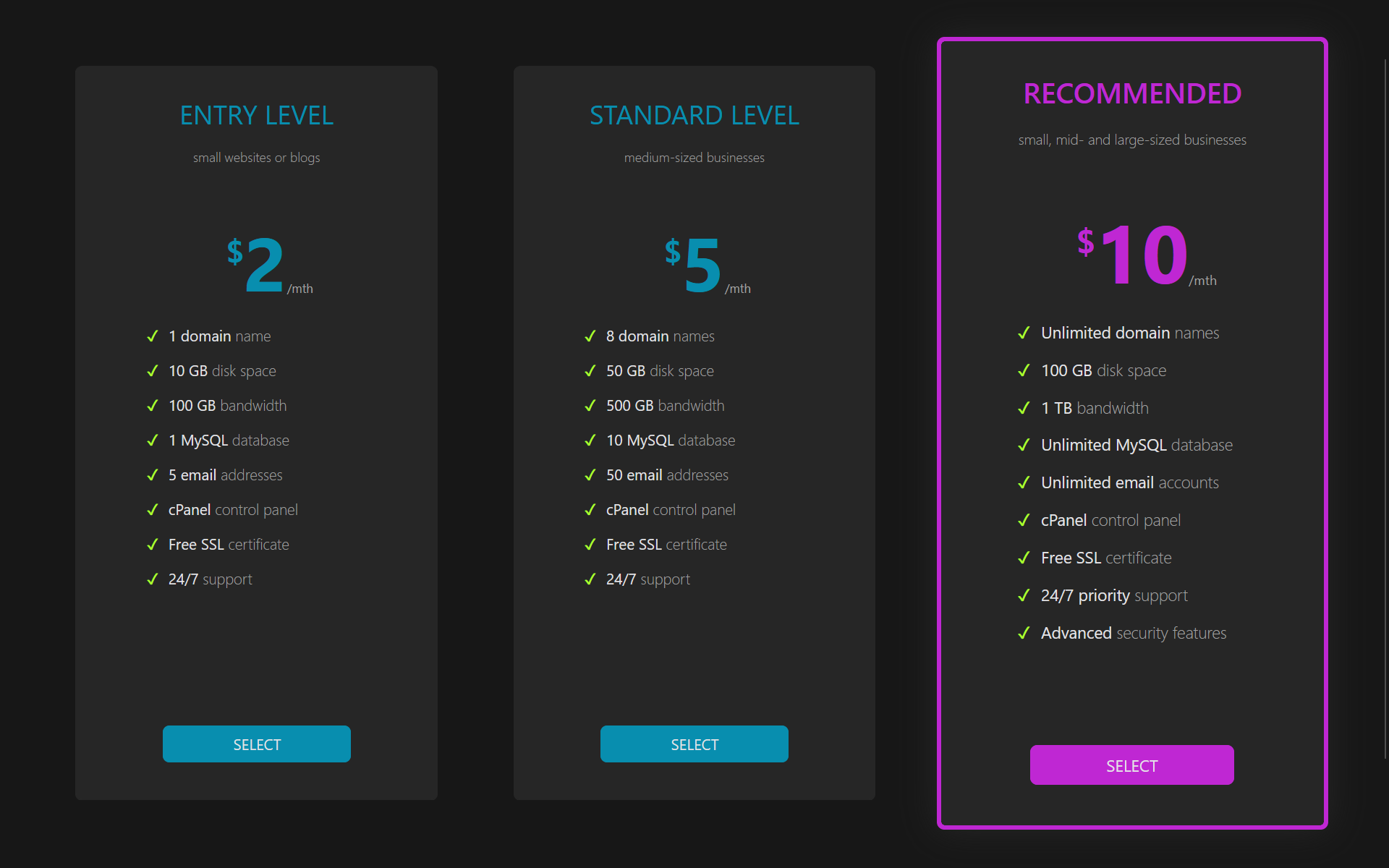 CSS files for these pricing panels are usually quite extensive. I decided to tackle creating one entirely classless. The result: 128 lines of code (2.89 Kb, raw). The HTML is entirely semantic and classless. And it looks fabulous. Have a look yourself, it's the screen shot at the right. Click it to see full view. The panel at the right is the one I hovered over for the screen shot.
Not only classless, but entirely responsive. I wrote it in such a way that it is simple to add a fourth, fifth, or more panels. And, they are fully responsive.
It's a lot easier to go classless than you think. First step is to look at any of the classless frameworks available. There are quite a few, it's actually daunting looking at some of the lists. But stick with the main ones. Github has a good list.
I want to make it clear, though. You can build some attractive sites with just classless CSS3 and semantic HTML5. You are likely, though, to need some classes if you plan on going to some extremes.
So far I have created (all classless):
- multi-level drop down horizontal navigation bar (navbar)
- multi-level drop down vertical navigation bar (sidebar)
- simple footer
- advanced footer
- advanced footer with a message box
- all footers can be sticky
- hero panel
- CTA panel
- Multi use color buttons
- fully interactive forms
- forms with or without icons (icons left, icons right, and icons both left and right)
- vertical cards
- horizontal cards
- pricing panels
I also have created a several grid systems (based on both CSS Grid Layout and Flexbox) for sticky footer (rows) and several multi-column grids for the standard three column blog, two column blog, and two column page layout with a vertical menu.
It's still in stress testing, hope to release soon.