Reminder, here's what my classless form icons look like:
 I wanted a really simple pure HTML mock up with the CSS doing the work – and without using any classes at all. Just plain semantic HTML.
The only class being used is the icon itself. I used the Font Awesome (v4.7.0) library in its default mode.
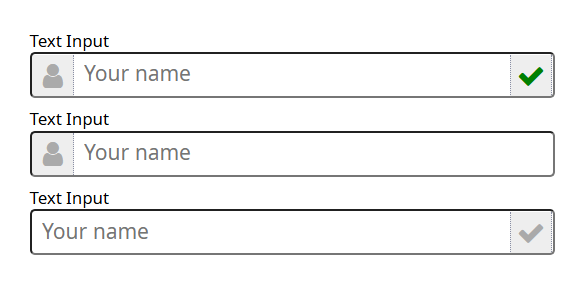
I have two sets of HTML code in the original article. The first is without any labels, relying on the input placeholder to indicate input contents. That's what I was trying to achieve. I also made the CSS work with labels, as the image at the right shows. The HTML code without labels:
<div>
  <div>
    <i class="fa fa-user fa-lg" aria-hidden="true"></i>
    <input type="text" id="name" name="name" placeholder="Your name">
    <i class="fa fa-check fa-lg" aria-hidden="true"></i>
  </div>
</div>

<div>
  <i class="fa fa-user fa-lg" aria-hidden="true"></i>
  <input type="text" id="name" name="name" placeholder="Your name">
</div>

<div>
  <input type="text" id="name" name="name" placeholder="Your name">
  <i class="fa fa-check fa-lg" aria-hidden="true"></i>
</div>
The next set is almost identical, only added labels. Here's the HTML:
<div>
  <label for="name">Text Input</label>
  <div>
    <i class="fa fa-user fa-lg" aria-hidden="true"></i>
    <input type="text" id="name" name="name" placeholder="Your name">
    <i class="fa fa-check fa-lg" aria-hidden="true"></i>
  </div>
</div>

<div>
  <label for="name">Text Input</label>
  <i class="fa fa-user fa-lg" aria-hidden="true"></i>
  <input type="text" id="name" name="name" placeholder="Your name">
</div>

<div>
  <label for="name">Text Input</label>
  <input type="text" id="name" name="name" placeholder="Your name">
  <i class="fa fa-check fa-lg" aria-hidden="true"></i>
</div>
Missing in all my articles about classless icons is the base CSS for the input. It helps to know that since the icon sizing is based on the input dimensions. So, here's the base CSS for the inputs:
textarea,
select,
input {
  border-radius: 4px;
  box-shadow: none;
  display: inline-block;
  font-size: inherit;
  font-family: inherit;
  max-width: 100%;
  padding: 0.35rem 0.5rem 0.5rem 0.5rem;
  width:100%;
}
Here's the CSS for the form icons, (note, there are two lines that you can un-comment to remove the right icon background color):
div > label {
  display:block;
  font-size:80%;
}

div:has(i.fa) {
  background-color:white;
  position: relative;
  margin-bottom:10px;
}
div > i.fa {
  background-color: #eee;
  border-right: 1px dotted #898EA4;
  color: #aaa;
  height:100%;
  line-height:1.5;
  max-width:1.5em;
  position: relative;
    top: 2px;
    right:auto;
    bottom:2px !important;
    left:2px;
  text-align:center;
  width:1.5em;
  z-index:1;
  +input {
    background-color:transparent;
    position:absolute;
      left:0;
    padding-left: calc(2.5em);
    width:100%;
    z-index:2;
    + i.fa {
/* add next two lines for transparent background and no border to right icon */
/*
      background-color:transparent;
      border:0;
*/
      color:green;
      position:absolute;
      right:30px;
      line-height:1.5;
      z-index:1;
    }
  }
}
div > input {
  background-color:transparent;
  position: absolute;
  z-index:2;
  + i.fa {
    background-color: #eee;
    border-left: 1px dotted #898EA4;
    color: #aaa;
    line-height:1.5;
    max-width:1.5em;
    position: relative;
      top: 2px;
      right:2px;
      bottom:2px !important;
      left:calc(100% - 1.5em - 2px);
    text-align:center;
    width:1.5em;
    z-index:1;
  }
}
Enjoy!