In the first example, I posted some code for a checkbox switch. That worked, but only replaced the checkbox element. If you attempt to put text beside it, the code fails. The code is based on an assumption that it will be an on/off switch with some other HTML element doing the explaining.
This is what we would expect from a standard HTML checkbox:

The code for that would be:
<input name="Checkbox1" type="checkbox" /> Checkbox, unchecked<br>
<input name="Checkbox1" type="checkbox" checked /> Checkbox, checked<br>
The first example I posted would not be able to do that. The CSS wasn't structured for text in the label portion. What it SHOULD look like with the checkbox switch code is:
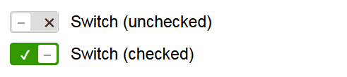
The code to generate that is:
<h2>Small</h2>
<div class="check-switch small">
  <label>
    <input type="checkbox" class="switch-control">
    <span class="switch-label">Switch (unchecked)</span>
  </label>
</div>
<div class="check-switch small">
  <label>
    <input type="checkbox" class="switch-control" checked>
    <span class="switch-label">Switch (checked)</span>
  </label>
</div>
The CSS for this has increased of course. It's now at 109 lines:
.check-switch {
  –switch-back-color: #dddddd;
  –switch-fore-color: #333333;
  –switch-height: 22px;
  –switch-radius:calc(var(–switch-height) / 7);
  –switch-toggle-border: 2px;
  –switch-width: calc(calc(var(–switch-height) * 2) + calc(var(–switch-toggle-border) * 2));
  –switch-padding-left: calc(var(–switch-width) + 0.75rem);
  –icon-back-color: #ffffff;
  –icon-radius:2px;
  –icon-size:0.8rem;
  –icon-on: '\2714';
  –icon-on-back-color: #339900;
  –icon-on-fore-color: #ffffff;
  –icon-on-indent: calc(var(–switch-height) / 2 - 2px);
  –icon-off: '\2716';
  –icon-off-indent: calc(var(–switch-height) / 2 * 3);
  –icon-none: '\2012';   /* EN dash */
  –icon-none-indent: calc(var(–switch-height) / 2 * 3);
  –icon-none-fore-color: #999999;
  –icon-none-line-height:1.4;
  –icon-checked-left: calc(var(–switch-height) + 6px);
  margin-bottom: 10px;
  &.small {
    –switch-height: 18px;
    –icon-none-line-height:1.0;
  }
  &.medium {
  }
  &.large {
    –switch-height: 28px;
    –icon-size:0.9rem;
    –icon-on-indent: calc(var(–switch-height) / 2 / 1.25);
    –icon-none-line-height:1.5;
  }
  &.x-large {
    –switch-height: 36px;
    –icon-size:1.1rem;
    –icon-on-indent: calc(var(–switch-height) / 2 / 1.25);
    –icon-none-line-height:1.7;
  }
  &.jumbo {
    –switch-height: 44px;
    –icon-size:1.4rem;
    –icon-on-indent: calc(var(–switch-height) / 2 / 1.3);
    –icon-none-line-height:1.7;
  }
  &.rounded {
    –switch-radius:calc(var(–switch-height) / 2);
    –icon-radius:calc(var(–switch-height) / 2);
  }
}
.check-switch label {
  cursor: pointer;
  padding-left: 0;
}
input[type='checkbox'].switch-control {
  margin-left: -9999px;
  position: absolute;
}
input[type='checkbox'].switch-control ~ .switch-label {
  display: inline-block;
  line-height: var(–switch-height);
  min-height: var(–switch-height);
  padding-left: var(–switch-padding-left);
  position: relative;
  user-select: none;
}
input[type='checkbox'].switch-control ~ .switch-label:before,
input[type='checkbox'].switch-control ~ .switch-label:after {
  position: absolute;
  transition: all 0.2s ease-out;
}
input[type='checkbox'].switch-control ~ .switch-label:before {
  background-color: var(–switch-back-color);
  border: 1px solid rgba(0,0,0,0.1);
  border-radius: var(–switch-radius);
  bottom: 0;
  color: var(–switch-fore-color);
  content: var(–icon-off);
  font-size: var(–icon-size);
  left: 0;
  text-indent: var(–icon-off-indent);
  top: 0;
  width: var(–switch-width);
}
input[type='checkbox'].switch-control ~ .switch-label:after {
  background-color: var(–icon-back-color);
  border-radius: var(–icon-radius);
  bottom: var(–switch-toggle-border);
  color: var(–icon-none-fore-color);
  content: var(–icon-none);
  font-size: var(–icon-size);
  height: calc(var(–switch-height) - calc(var(–switch-toggle-border) * 2));
  left: var(–switch-toggle-border);
  line-height: var(–icon-none-line-height);
  top: var(–switch-toggle-border);
  text-align: center;
  width: calc(var(–switch-height) - calc(var(–switch-toggle-border) * 2));
}
input[type='checkbox'].switch-control:checked ~ .switch-label:before {
  background-color: var(–icon-on-back-color);
  color: var(–icon-on-fore-color);
  content: var(–icon-on);
  text-indent: var(–icon-on-indent);
}
input[type='checkbox'].switch-control:checked ~ .switch-label:after {
  left: var(–icon-checked-left);
}
The "medium" class exists only to make it consistent and easy for the HTML coder.
You can see this at https://blog.aprevost.com/checkbox_replacement.html