Have to tell the truth here ... I've been avoiding CSS Grid. I really didn't get how it could either replace Flexbox or co-exist.
I had a similar experience when Flexbox first hit the scene. To that point, and like everyone else, my company used floats to achieve columns. We tried, emphasis on tried, to achieve responsive designs. But until Flexbox, it was elusive.
Flexbox changed all that. Finally a responsive row/column based tool. In a short time frame, several versions of Flexbox have been released. There are still issues with Flexbox, but most of us have learned how to work around them. For example, the Flexbox gap doesn't work well. If you use a row with no wrap, gap works perfectly. If your row wraps, gaps fail. Most of us have given up on using gap and have a work around using margins with first-child and last-child to cancel out at the ends.
Then along comes CSS Grid Layout. First, I don't like the designation "CSS Grid" (Flexbox is a grid tool too). A grid is a layout in a page design. It shouldn't also confuse by naming a tool the same.
Articles about CSS Grid are not helping. Most are regurgitating the same stuff. Same or similar graphics that describe the technology. Examples that don't make much sense. Too much emphasis on the new "fr" measurement tool in CSS Grid.
I've designed a few things using CSS Grid. All basic components or elements. I finally tried a comple layout using solely CSS Grid. My first attempts were to find a way to have CSS Grid replace Flexbox ... and I really mean NOT co-exist, but replace. So, let me tell you the results:
- I created a total of 11 variables. One for grid gap, nine for semantic language column widths, and one for css columns definition
(the nine semantic language column widths aren't critical to the functioning of the grid) - I then created one single class with four elements. Four. Period.
That's my entire CSS Grid Layout. It supports from one single column to 'N' ... you want 99 columns, my CSS handles it – DYNAMICALLY!.
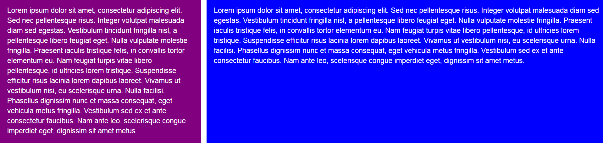
I used the following code to create a two column layout. First column is one-third of the width, second column is two-thirds of the width:
<div class="grid-wrapper">
  <div class="box one">
    <p>Lorem ipsum dolor sit amet, consectetur adipiscing elit. Sed nec pellentesque risus. Integer volutpat malesuada diam sed egestas. Vestibulum tincidunt fringilla nisl, a pellentesque libero feugiat eget. Nulla vulputate molestie fringilla. Praesent iaculis tristique felis, in convallis tortor elementum eu. Nam feugiat turpis vitae libero pellentesque, id ultricies lorem tristique. Suspendisse efficitur risus lacinia lorem dapibus laoreet. Vivamus ut vestibulum nisi, eu scelerisque urna. Nulla facilisi. Phasellus dignissim nunc et massa consequat, eget vehicula metus fringilla. Vestibulum sed ex et ante consectetur faucibus. Nam ante leo, scelerisque congue imperdiet eget, dignissim sit amet metus.</p>
  </div>
  <div class="box two">
    <p>Lorem ipsum dolor sit amet, consectetur adipiscing elit. Sed nec pellentesque risus. Integer volutpat malesuada diam sed egestas. Vestibulum tincidunt fringilla nisl, a pellentesque libero feugiat eget. Nulla vulputate molestie fringilla. Praesent iaculis tristique felis, in convallis tortor elementum eu. Nam feugiat turpis vitae libero pellentesque, id ultricies lorem tristique. Suspendisse efficitur risus lacinia lorem dapibus laoreet. Vivamus ut vestibulum nisi, eu scelerisque urna. Nulla facilisi. Phasellus dignissim nunc et massa consequat, eget vehicula metus fringilla. Vestibulum sed ex et ante consectetur faucibus. Nam ante leo, scelerisque congue imperdiet eget, dignissim sit amet metus.</p>
  </div>
</div>
Here's what that looks like:
If I want to change the column widths, I can do it dynamically. Here's how that looks:
<div class="grid-wrapper" style="–columns: 50% 50%;">
or:
<div class="grid-wrapper" style="–columns: 50% 1fr;">
... both would do exactly the same thing.
For column widths, you can use fixed sizes (ie: 100px, 20em, 20rem) or percentages as shown above, or the new "fr" unit. "fr" is short for "fraction" (according to Mozilla Foundation).
What's interesting is that if you create a third column, it will automatically wrap to the next line. Automatically, and still honor the "gap" instruction.
However, it's easy enough to create a third column dynamically. My CSS style sheet creates a grid object with a default of two columns. To get a third column is as simple as changing the tag with 'class="grid-wrapper". Here's an example:
<div class="grid-wrapper" style="–columns: 25% 50% 25%;">
It's that simple. And there is absolutely no limit on how many columns you can create ... I mean, other than physical limits (like screen width and limits of padding and gaps between each column).
I'll be discussing CSS Grid Layout in more columns, come on back.
And, a quick note on the styles shown above. You may not recognize the style. It's actually modifying the CSS variable of the name "–columns" ... and it only applies while used within the one tag it is found (and descendants). If I use the default tag again, it reverts back to my CSS file defaults.